ImageCLEF 2026 GANs Exploratory Data Analysis
ImageCLEF 2026 GANs Exploratory Data Analysis
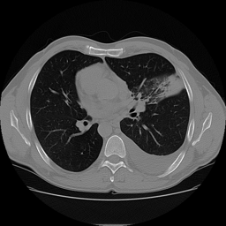
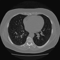
One of these is fake, and you can probably already tell which one it is.
Recently, I have been leading a small team of 3 students at Georgia Tech in a project to explore the use of generative models for privacy-preserving image generation for CT slices of patients' lungs. We are specifically participating in the ImageCLEF 2026 ImageCLEFmed GANs competition Subtask 3 "Privacy-preserving CT slice generation". In this post we will go over some exploratory data analysis on the 2025 dataset. Unfortunately, the 2026 dataset was not available at the time of presenting our results for the EDA work. We were able to acquire the 2025 data and perform some preliminary analysis with the overarching goal being to determine if the 2025 generated dataset was privacy-preserving.
The Dataset
We have in total 7000 generated images and 700 real images. Running file on one of the images we get
❯ file generated_1.png
generated_1.png: PNG image data, 256 x 256, 8-bit colormap, non-interlaced
What are the differences between the real and generated datasets?
Certainly, we want to start by asking. Are there any differences at all? The first slide, from team member Samir Hadi, answers that quite well.
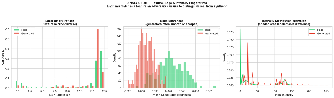
Credit: Samir Hadi
We have a few traditional image processing techniques applied to the real and generated images.
-
Local Binary Patterns (LBP): This describes local texture of an image by comparing each pixel to its neighbors. The resulting patterns can be used to analyze the texture differences between real and generated images. We don't see much difference here, which is a good sign for the generated images. We want them to be as close to the real images as possible in terms of texture.
-
Edge Sharpness: Here we are looking at the sharpness of edges in the images. The generated images do seem to have, on average, smoother edges than the real images. This is a common artifact of generative models. However, the magnitude of the difference is not huge and there is still substantial overlap between the two distributions.
-
Intensity Histogram: This is a histogram of pixel intensities in the images. Here we see a very significant difference. The histogram for the generated images is not natural at all, with a "spiky" distribution rather than the natural curves of the real images. It almost appears like the model is generating images with a limited set of pixel intensities rather than a continuous range.
Below we have an analysis performed by myself using curvlets. Curvlets are similar to wavelets but are designed to capture edges and curves in images more effectively. Where wavelets are good at capturing point singularities, curvlets are better at capturing "curve singularities". In more technical terms, curvlets can capture directional information in images, with far fewer coefficients than wavelets for the same level of detail.
We used the python library curvlets to do the analysis for us. Below are the results for 3 metrics we will explain in a moment. In all three plots below we are looking at the mean difference between the real and generated images.

Credit: Eric Regina
-
Energy: This is a measure of the total "energy" in the curvelet coefficients (sum of the squared coefficients). A higher energy indicates that there are more significant features in the image. The generated images have significantly lower energy than the real images in the first scale. This suggests that they are missing some of the fine-scale structure present in the real images.
-
Kurtosis: This is a measure of the "tailedness" of the distribution of curvelet coefficients. A higher kurtosis indicates that there are more extreme values in the distribution. The generated images have a much lower kurtosis than the real images, which suggests that they are missing some of the extreme values present in the real images. This is likely because the generated images are smoother and less detailed than the real images.
-
Directional Anisotropy: This is a measure of the directional distribution of the curvelet coefficients. A higher directional anisotropy indicates that there are more coefficients in certain directions than others. The generated images have a much lower directional anisotropy than the real images, which suggests that they are missing some of the directional information present in the real images. Looking visually at the generated images, they tend to be more symmetric and uniform compared to the real images. That's likely where this is coming from.
In general, I didn't find the curvlet analysis to be as informative as I had hoped. These methods were quite slow to compute (especially for all 7000 generated images), and the results were not as clear as the more traditional image processing techniques. That said, I am somewhat of a novice in the wavelet-based methods.
Without a doubt, there are detectable differences between the two distributions.
What does the manifold embedding of the two distributions look like?
I then took a look at a manifold embedding of the two distributions. I used a pre-trained ResNext-101 model to extract features from the images and then used UMAP to reduce the dimensionality of the feature space to 2 dimensions for visualization. Below is the rather striking result.

Credit: Eric Regina
In the UMAP plot in the top left we can see that the two distributions are almost linearly separable.
- The GAN model mostly covers the set of outliers.
- The GAN model seemingly ignores most of the "core" of the real distribution.
- About 10% of the real distribution is outliers.
We would expect to see mode collapse.
Checking for Mode Collapse
To check this a bit more directly, we ran a near-duplicate analysis using BiomedCLIP embeddings and flagged image pairs with cosine similarity at least 0.95. This gives us a rough way to ask whether the model is actually producing diverse samples, or if it is mostly generating small variations of the same few images.
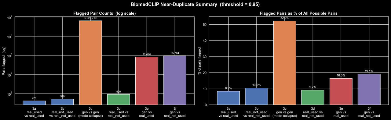
Credit: Rich Arnaud
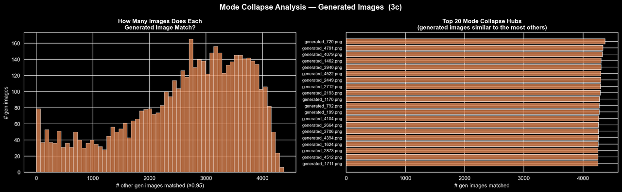
Credit: Rich Arnaud
Here the picture is, unfortunately, quite clear. The real dataset does contain some near-duplicates, which is not especially surprising for CT slices, but the generated dataset is in a completely different regime. Over half of all possible generated-generated pairs are flagged as near-duplicates at this threshold, whereas the "real-real" comparisons are only around 8-10%. The second figure makes this even more striking: many generated images are near-duplicates of several thousand other generated images, and some individual samples are similar to more than 4,000 others. So rather than learning the full structure of the real distribution, the GAN appears to have collapsed onto a relatively small set of templates and is producing minor variations of them. At least on the 2025 data, it seems the evidence for substantial mode collapse is quite strong.
Future Work
We have already begun work on the 2026 dataset, and have generated some preliminary results utilizing flow matching, which I will cover in a future post. As a fun preview, check out the UMAP embedding of the 2026 data compared to the data we generate with flow matching. The results are quite promising, and we are seeing much better coverage of the real distribution with the flow matching model compared to the GAN.

Credit: Eric Regina
Special Thanks
- Thank you to my awesome team members Samir Hadi, Rich Arnaud.
- Thank you to the amazing Data Science @ GT student organization for providing support and resources for this project. Thank you for pushing us to grow and learn. We really mean it.
- Thank you to the ImageCLEF 2026 organizers for providing the dataset and hosting the competition. We are excited to see how our work compares to other teams in the competition and to learn from their approaches as well.